
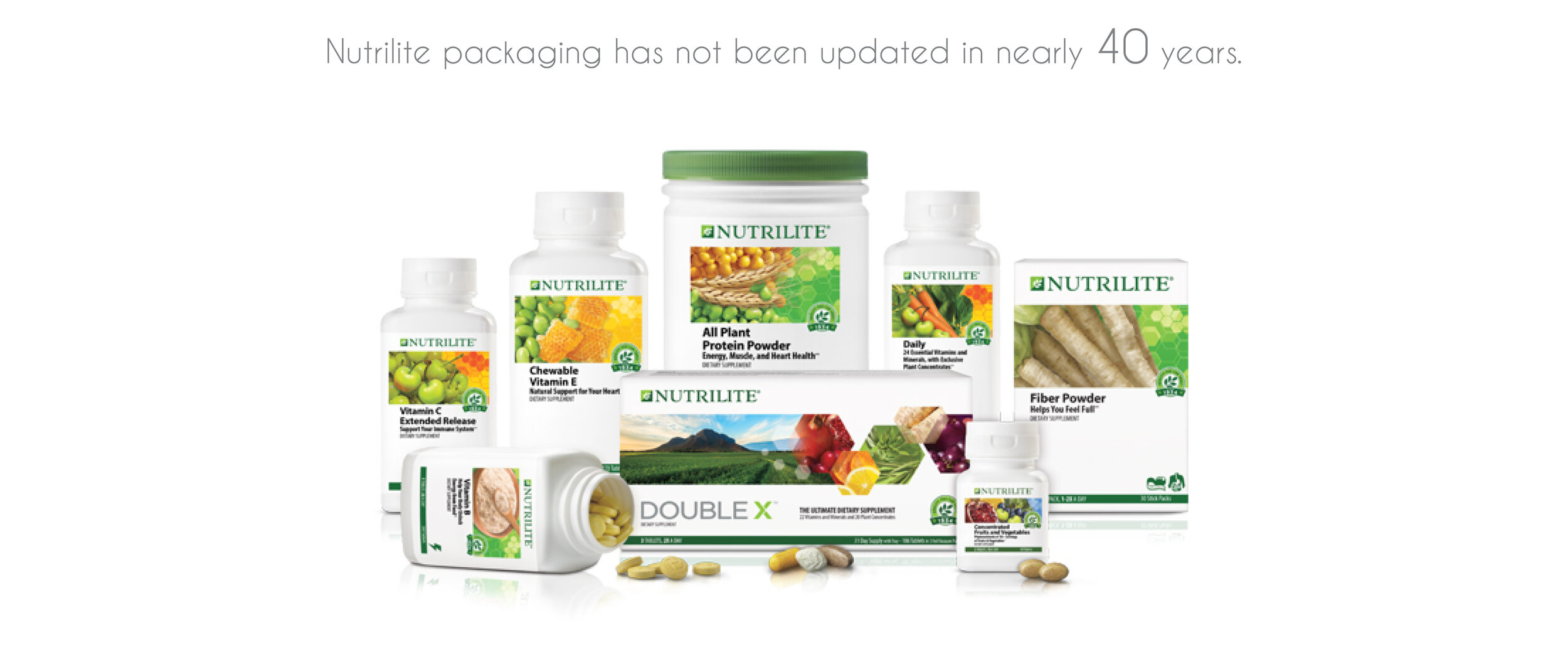
Overview: A new identity for Nutrilite’s supplement bottles that reflects the quality of the supplements inside.
My role was lead designer on this project.
Client: Nutrilite
Market: Global (6 continents)
Launch Timing: 2019
Design Patents: 4
Industrial Design: Zane Hoekstra

The Goal
Develop a cohesive, visual language that reflects the quality of the $5B Nutrilite brand, but with a cost neutral budget.

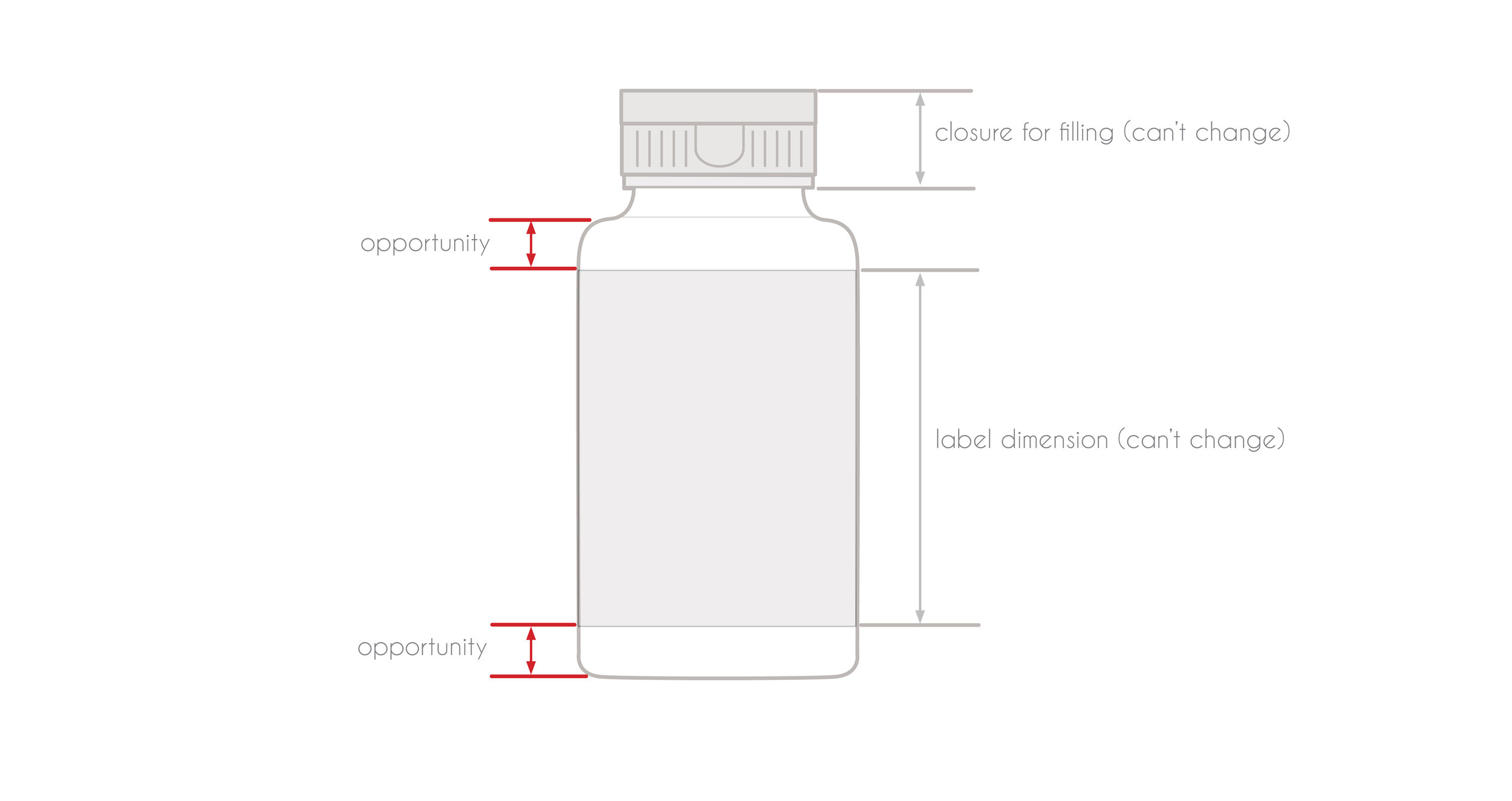
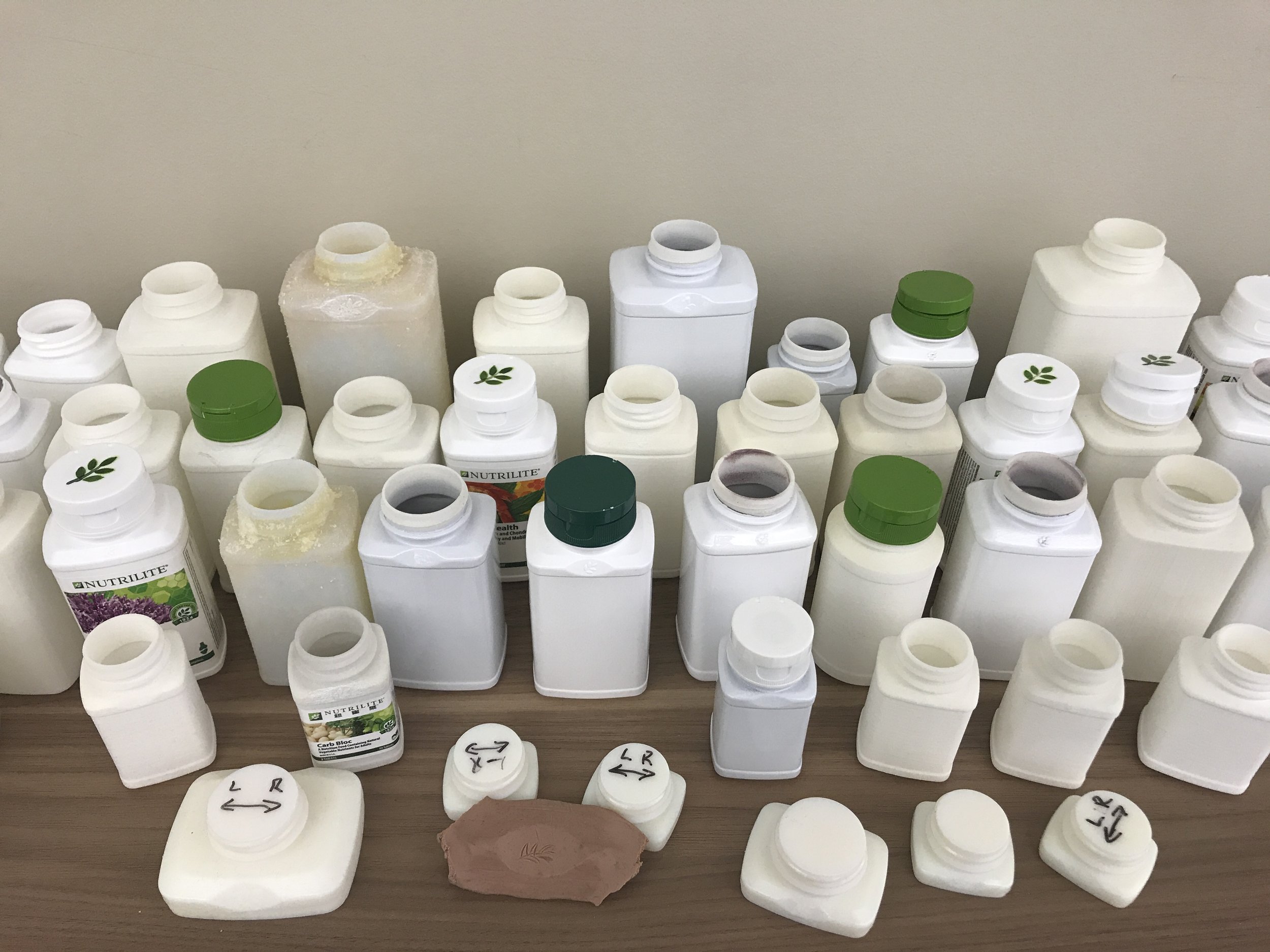
Manufacturing Constraints
The bottle sizes and overall form were dictated by the existing filling and label machines.
We did not have a budget to redo all of the manufacturing line change parts, thus I got creative with subtle details.
Elegance and Presentation
The focus was on achieving a simple, elegant, and refined aesthetic.
Structural elegance, beautiful surface transitions, and the desire for the package to present itself to the user were all key to the design success.

Branding = Front and Center
A lot of time was spent ensuring that the badge was large enough to display the logo mark, but still elegantly blended into the surface.
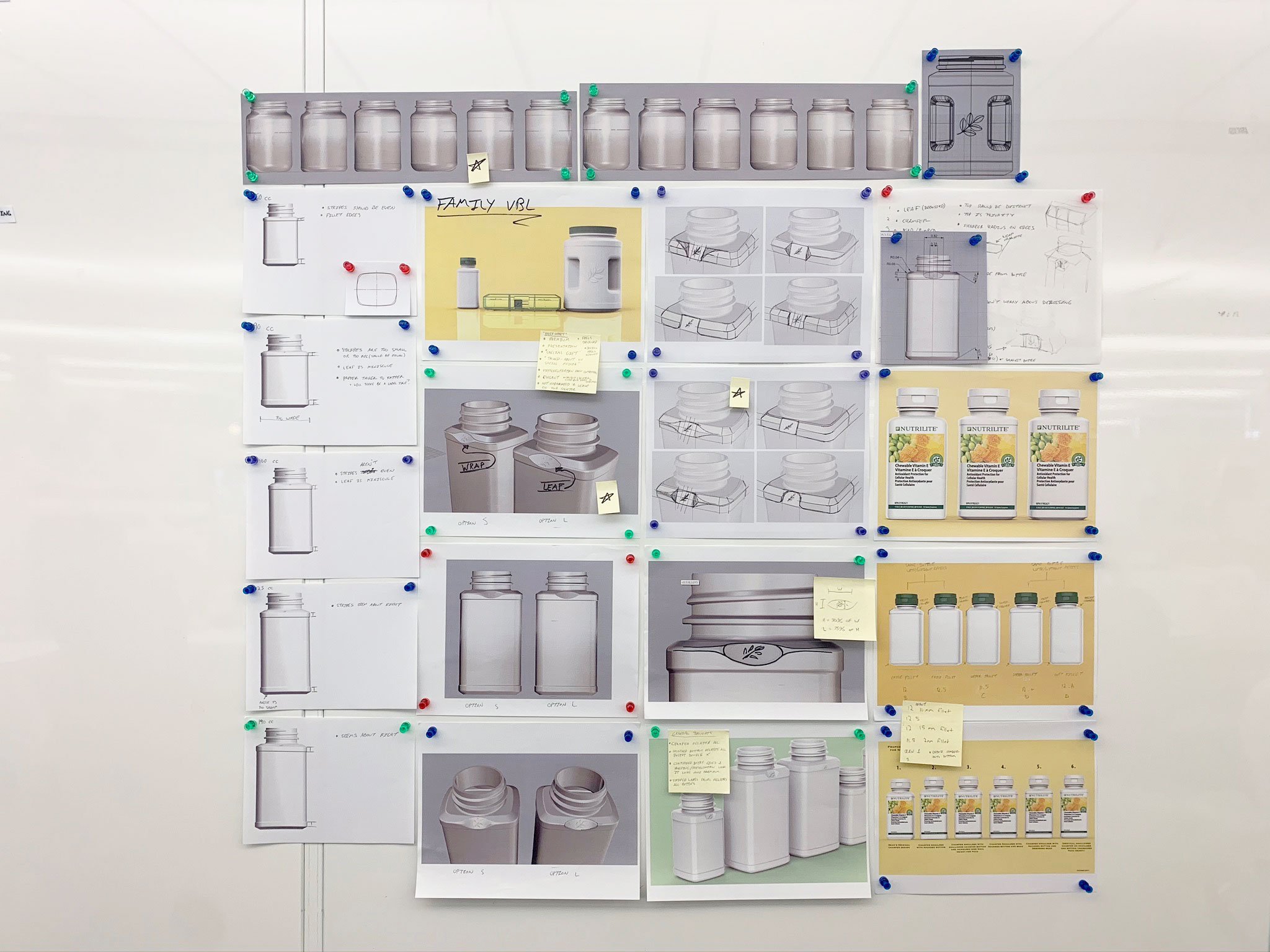
Tying it Together
Cohesion was achieved by developing a visual brand language which unified the various packaging formats.


© Zane Hoekstra 2024